A research poster is a powerful visual tool for presenting academic work at a scientific conference or university poster session. For researchers, it provides an opportunity to share findings, promote discussion, and receive feedback from others. Likewise, for students, it’s an excellent way to communicate a research project.
Having supervised hundreds of project students and assessed research posters over more than 20 years as a psychology professor, I’ve seen firsthand what makes a good poster—and the common mistakes that can undermine it.
If you’re new to creating a research poster, the process can feel daunting. Fortunately, this guide breaks it down into simple, practical steps, with expert tips to help you design a poster that is clear, engaging, and professional.
TL;DR: How to Make a Research Poster
| Tip | Why It Matters |
|---|---|
| Keep it concise and visual | Helps viewers quickly understand your key message. |
| Guide the viewer with a logical flow | Makes your poster easy to follow from start to finish. |
| Use clean design and accessible fonts/colours | Improves readability and creates a professional appearance. |
| Balance text and visuals | Enhances understanding without overwhelming the audience. |
| Practice your presentation skills | Helps you explain your research and answer questions confidently. |
📌 Bottom line: A successful research poster is clear, visually engaging, easy to navigate, and supported by a confident presentation.
What Should a Research Poster Include?
Before diving in, let’s look at the typical structure of a research poster. For example:
| Section | Purpose |
|---|---|
| Title | A concise summary of your project |
| Introduction | Background and purpose of your research |
| Objectives / Research Questions | What you’re aiming to explore? |
| Methods | How you collected and analysed your data |
| Results | Key findings in visuals (graphs, charts, etc.) |
| Discussion | Significance of your findings |
| Conclusion | What do your results mean overall? |
| References | Sources cited |
| Acknowledgements | Thank any contributors or funders |
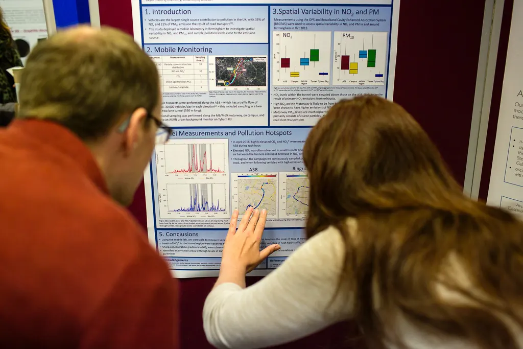
Additionally, here’s what a research poster looks like:

How to Make a Research Poster (Step-by-Step)
Step 1: Plan and Organise Your Content
Don’t jump into the design right away. Instead, begin by outlining your content. Decide what you want to include, then sketch how you plan to arrange the sections. Your poster should follow a logical flow, guiding the viewer smoothly from start to finish.
📌 Think of your poster like a story with a beginning, middle, and end.
Step 2: Gather Your Materials Before Making Your Research Poster
Next, bring together everything you’ll need to make the research poster. For example:
- Key text (titles, abstracts, bullet points).
- Graphs and charts.
- Diagrams or photos.
- References and citations.
📌 Only include the essentials. So, keep the text brief and focus on your most impactful findings.
Step 3: Design an Effective Layout
Then, focus on creating a layout that is:
- Clean and structured.
- Easy to read from a distance.
- Split into clear sections with headings.
📌 Choose a clean and professional layout. Use tools like Canva, PowerPoint poster templates, or BioRender to get started. In addition, structure your content in columns or sections to make it easy to follow. And make sure it isn’t crammed or overflowing.
Step 4: Use Visuals to Enhance the Viewer’s Understanding
Remember, visual elements make your poster more engaging and easier for others to understand. Therefore, use them wisely:
✅ Use:
- Graphs (bar, pie, line).
- Tables for summarised data.
- Flowcharts or infographics for processes.
❌ Avoid:
- Cluttered visuals.
- Tiny text in figures.
- Unexplained graphs.
📌 Every visual element should have a clear title and legend.
Step 5: Choose Fonts and Colours Carefully
At this point, keep your poster readable and attractive:
- Use sans-serif fonts (e.g., Arial, Calibri).
- Stick to 2-3 font sizes (e.g., Title > Headings > Body text).
- Ensure text is readable from a metre away.
- Choose a complementary colour palette (avoid clashing tones).
📌 Use colour to highlight—not overwhelm.
Step 6: Balance Text and Visuals
Too much text = overwhelming. On the other hand, too many visuals = confusing. Therefore, you need a balance.
✅ Use:
- Bullet points.
- Short paragraphs.
- Clear headings and subheadings.
Whitespace is your friend—it creates breathing room and improves focus.
📌 Don’t fill every inch of space!
Step 7: Proofread and Get People’s Feedback
Before printing or submitting:
- Double-check for typos, grammar mistakes, and formatting errors.
- Make sure all visuals are labelled and cited.
- Ask a peer or mentor to review your poster—fresh eyes spot things you might miss.
📌 Use tools like Grammarly or Hemingway Editor. Additionally, ask peers for feedback.
Step 8: Print and Practice Your Presentation
Lastly, once your poster is finalised:
- Save it as a high-res PDF.
- Check the dimensions match the required size (typically A0 or A1).
- Practice your pitch—know your poster inside out.
- Be ready to engage with questions during your presentation.
Final Thoughts on Making Research Posters
In short, creating a research poster isn’t just about showing your results—it’s about telling an engaging, understandable and impactful story. Whether preparing for a class presentation or an international conference, following these steps will help you create stand-out posters.
If you found this guide helpful, please share it with your peers!
Want more tips? Then, check out my other articles on academic writing and study skills.